Biophilic Design

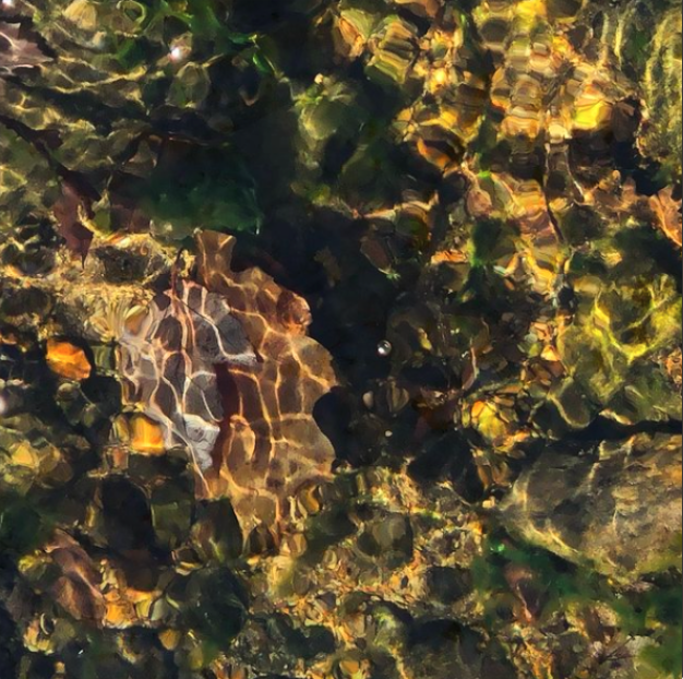
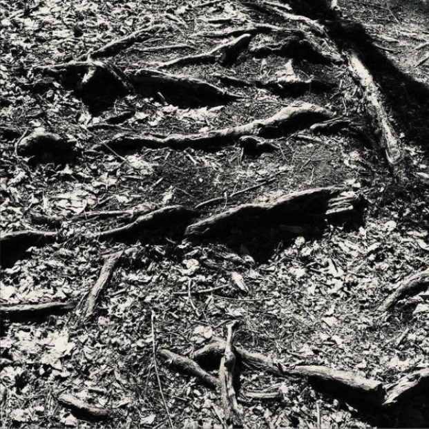
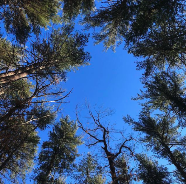
A few years ago, I started to take walks every day to explore the area around my neighborhood. I found myself drawn to simple design elements in the streets, up in the sky, and started to post on Instagram @designeducator. I labeled my posts ‘design walks’ as a way of documenting what I noticed each day. The design walk is time in the studio, a space inhabited by the community I live with my neighbors, our skies, our trees, our plants, insects, and animals. Friends and strangers alike talked to me about the images. The process started a dialogue.

Subsequently, I started to learn more about biophilic design. I started to connect the process of walking, noticing, posting and building a dialogue on social media. The mere act of noticing, taking a photo, and sharing was therapeutic.

Last year, my longtime mentor, Founder of Fenway High School and Co-Founder of the Education Resources Consortium, Larry Myatt and I composed a slide show of biophilic images including his and mine to use in workshops asking:

Where do you find connection?

Where do these images take you?

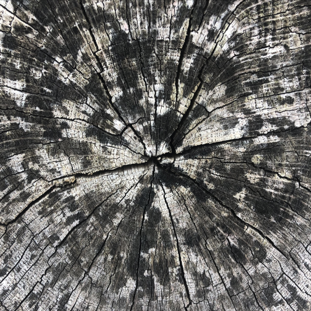
With each workshop, each participant makes meaning in different ways finding different associations. The associations can sometimes be a memory like a time remembered in one’s life or a connection to a film. These symbols and structures can be a metaphor for something greater. I am always curious to understand when images speak in ways texts do not.

Biophilic design has 14 patterns as defined by Terrapin Bright Green Studios.

Four that intrigue me most under Terraphin’s category of ‘Nature of Space’ include:

Prospect

Refuge

Mystery

Risk/Peril

These are most representative within the context of Larry and my workshop and participant responses. Its curious how images can produce responses with such a range of emotions.

How can schools be designed to support a range of emotion within it’s spaces using nature both within the local community and within one’s own unique nature?

How might students explore and use design elements within their own communities to support themselves but also their community?

Robert Lamour was a metrologist

dad.jpg

I was taught to measure with my eye in design school, measuring the use and the beauty of form within letters, proportions, and patterns. At the same time, I observed my father calculating weight based on measurement systems. Robert Lamour was a metrologist able to measure the weight of ink on a dollar bill. This means he used prisms to magnify particles of information. His optical prism serves as a metaphor for my teaching. A prism within becomes a magnification of what the individual sees.

Marks, choices output evidence

Marks, choices output evidence for the inner knowing within. Our distinction. No one can take this work away from us. Structure, how much do we need and how much are we willing to let go of to understand our own rules.

Recognition

Design Instinct Learning recognizes students where they are within their own visual culture at 3, 18, or 91 years rather than a blank slate of knowing and experiences. I want to build a learning environment that leverages all grid systems, image-making strategies, typographic voices, color systems, arrangements while embracing vulnerability, preferences and tendencies.

Design seeing

I look outside my studio window every morning and have never noticed such a bright light.

IMG_2223.jpg
IMG_2222.jpg

From my father

Design is Life. 

A Window to the Mind.

Its exercise is always moving, sketching.

Nothing stands still.

Line blooms into thought.

The DNA of Our Design Instincts

Our designs combine our conscious and unconscious. One example is a designed space like our bedroom or home office. Within these spaces live sacred objects, images, and texts. They might be arranged in loose stacks or neat piles or folders. These structural arrangements might be linear, circular, rootlike, or a combination.

Our “file cabinets” become and evolve throughout our lives. All of the texts, objects and images we keep as artifacts have origin in our memories, dreams, and reflections.

a visual metaphor reminding me that design is life (my fathers optical prism)

a visual metaphor reminding me that design is life (my fathers optical prism)

The Design Instinct

As adults, we sometimes recognize our design instincts, what seems to satisfy us in small, or not so small ways. — how we like our socks folded, a preference for lemon, lime or plain water, the cast of sunny or rainy days, how our toast browns. These instincts reflect the patterns of our own unique nature.

lemon.jpg

Networks

The need for ‘design’s visual systems’ during this time of uncertainty.

Perhaps this is why we like Facebook because you can write to a picture?

The first school writing project I remember is writing on paper with lines on the bottom and drawing a picture on top. I felt comfortable in this Kindergarten learning space. This picture writing felt natural oddly just as it does for my son. Like me, this picture writing is a comfort for him. As I moved up in grades picture writing was less and less accepted as if pictures were training wheels for the writing. From this point on, writing was torture. I lost any love or connection to it.

Fast forward twelve years. I am in college taking my first typography course in my declared graphic design major. My professor starts with a plain (sans serif without feet) letter capital E and asks us to sketch this letter form first in pencil, then opaque black paint altered with opaque white paint looking deeply at the form and counter form balance for six hours at a time. At first, the letter and exercise seemed pointless but after hours of pure seeing moving between black and white, a light went on in the dormant tunnel of my educational history. A plain letter isn’t plain. It has visual characteristics and nuances. Did you know that the white space between the top and middle stroke of a capital plain letter E is smaller than the bottom but looks equal? As I advanced in typography, I furthered the E’s journey to include weight, scale and space changes thus changing my relationship to language forever. 


Make it pretty

"Kristina, can you take this and make it pretty?"

Understanding pretty

It is subjective

Based context/preferences

Making it bigger

Using a template


Learning to read and write for this first time

To learn graphic design is to learn a language, not unlike learning to read and write for this first time. The difference? Vocabulary includes pictures, text and the visual aspects of text. Consider it learning to read and write but with an extended communication toolkit. 

Choices

You plan and make choices everyday. Identify the visual ones, the one visually perceptible by your students, things they can see, judge, ignore, love, engage with, resist. Allow your inner critic to build relationships to reflect on the single choices but also that choice in relationship with your classroom’s physical and digital environment.

Tackling the definition again

Graphic design is a language of pictures, letters, words, paragraphs, colors, and shapes. It allows us to take the everyday and make sense of it, provide a critical lens to question and make necessary changes.

It opens a flexible iterative mind literally helping to visualize these different tapes (another 80s reference) in the minds eye. What If it were blue not red? What if that were bigger? What if this had a different typestyle? Like active drafts or tests, the mind visually tests.